HelpMeGrow struggled with a cluttered interface that frustrated users and slowed down their ability to manage social media and track engagement, so we redesigned it to be clear, efficient, and purpose-driven for small business owners.
🎯 The Problem
Users found HelpMeGrow’s interface overwhelming and confusing, which blocked them from effectively using the platform’s key features, especially when under time pressure.
This led to:
Difficulty navigating core tools
Low engagement with dashboards and analytics
Frustration and feature abandonment
This wasn’t just a visual problem, it was a usability and effectiveness problem that limited business value.
👤 My Role & Context
Lead Product Designer
I led UX and interaction decisions for the web app redesign.
Worked closely with stakeholders to translate business goals into a user-centric experience.
Project type: Web application
Focus: UX clarity, navigation, dashboard usability
💡 What Users Were Struggling With
Users felt lost in the interface
Dashboards and menus showed too many options up front, which meant users didn’t know where to start when they logged in.
Users wanted quick wins
Small business owners wanted to complete tasks (like scheduling a post) fast.
Analytics were overwhelming
Charts and data were visually dense and lacked hierarchy, so users couldn’t quickly extract insights.
These insights helped us make design decisions with purpose, not just pretty screenshots.
🔍 Key Design Decisions & Rationale
Here’s how the insights translated into specific UX choices:
1️⃣ Simplify the Primary Navigation
Problem observed: Users were overwhelmed by too many options at once.
Decision: Collapse navigation to core categories:
Overview
Schedule
Messages
Analytics
Why it matters:
This reduced cognitive load on first touch, users immediately know where to go.
2️⃣ Redesigned the Dashboard for Clarity
Problem observed: Dashboards combined too many widgets with equal visual weight.
Decision:
Prioritized high-impact metrics
Reduced non-essential content above the fold
Emphasized “next actions” (e.g., “Schedule a post”)
Outcome intention:
Users should understand their account status and what they could do next within seconds of logging in.
3️⃣ Consolidated Posting & Scheduling Workflow
Problem observed: Users got lost between features for posting, calendars, and scheduling.
Decision:
Created a streamlined workflow that:
Combines posting + scheduling in one entry point
Highlights connected social accounts
Shows upcoming scheduled posts
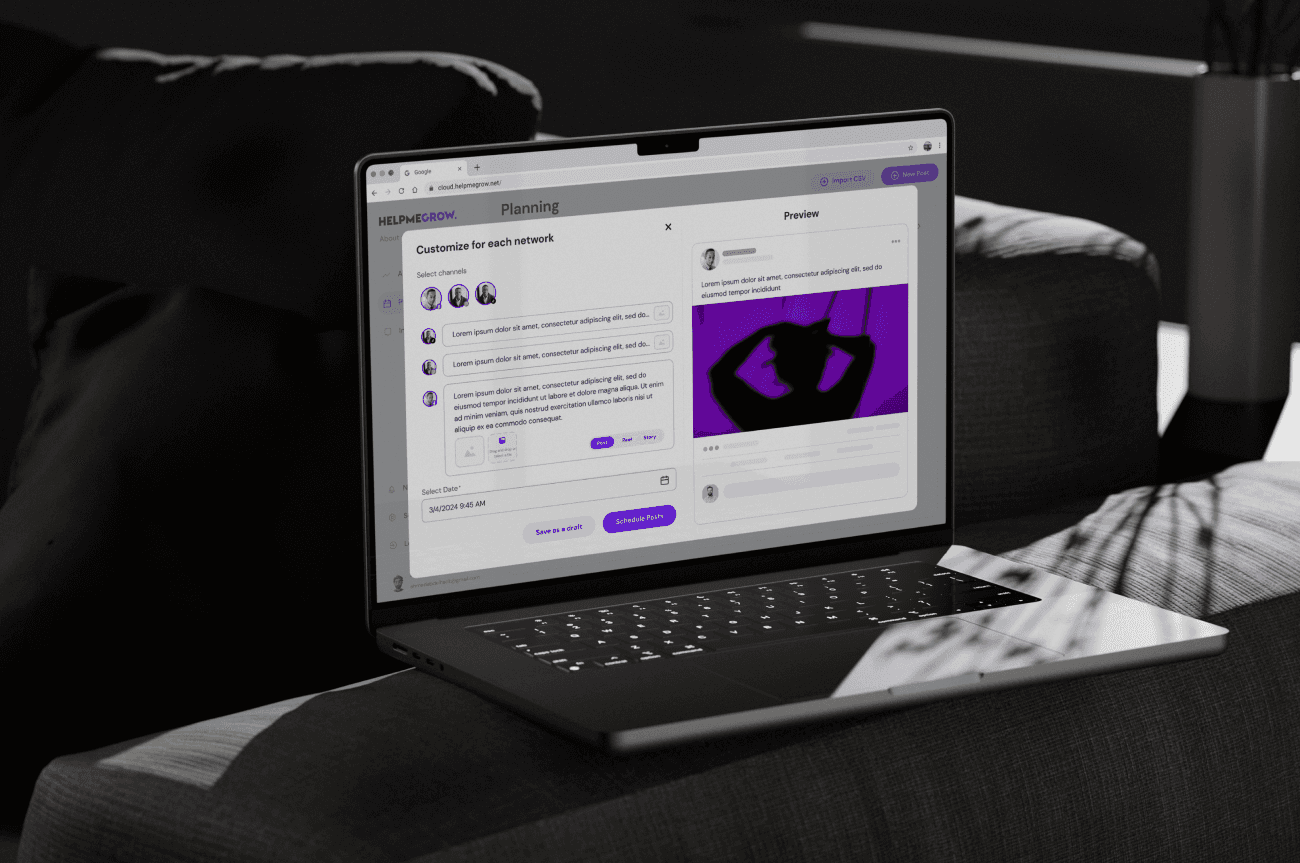
This aligns with how business owners actually work fast, task-oriented, and low-friction.
📈 What the Redesigned Screens Do
Dashboard View
Shows core metrics prioritized by user needs
Quick link to drafting and scheduling posts
Schedule Planner
One view to plan and visualize posts
Actionable buttons guide next steps
Unified Messaging Inbox
All channels combined
Smart filters help focus responses
Each of these decisions reduces friction for core user behaviors.
🔍 Key Design Decisions & Rationale
Here’s how the insights translated into specific UX choices:
1️⃣ Simplify the Primary Navigation
Problem observed: Users were overwhelmed by too many options at once.
Decision: Collapse navigation to core categories:
Overview
Schedule
Messages
Analytics
Why it matters:
This reduced cognitive load on first touch, users immediately know where to go.
2️⃣ Redesigned the Dashboard for Clarity
Problem observed: Dashboards combined too many widgets with equal visual weight.
Decision:
Prioritized high-impact metrics
Reduced non-essential content above the fold
Emphasized “next actions” (e.g., “Schedule a post”)
Outcome intention:
Users should understand their account status and what they could do next within seconds of logging in.
3️⃣ Consolidated Posting & Scheduling Workflow
Problem observed: Users got lost between features for posting, calendars, and scheduling.
Decision:
Created a streamlined workflow that:
Combines posting + scheduling in one entry point
Highlights connected social accounts
Shows upcoming scheduled posts
This aligns with how business owners actually work fast, task-oriented, and low-friction.
📈 What the Redesigned Screens Do
Dashboard View
Shows core metrics prioritized by user needs
Quick link to drafting and scheduling posts
Schedule Planner
One view to plan and visualize posts
Actionable buttons guide next steps
Unified Messaging Inbox
All channels combined
Smart filters help focus responses
Each of these decisions reduces friction for core user behaviors.


