Project details
Client:
Saleh
Tool:
Figma, Miro, Balsamiq, Microsoft Teams, notion
Tebr - A Trusted Marketplace for Buying, Selling & Renting Gold in Saudi Arabia
🧩 The Problem
The gold jewelry market in Saudi Arabia is fragmented and traditionally offline. Buyers and sellers lack a centralized, trustworthy digital platform, especially for high-value transactions like gold jewelry sales and rentals.
Key pain points included:
Trust issues (fear of fraud, authenticity concerns)
Fragmented inventory and discovery
No formal rental process
Limited inventory tools for shops
🎯 Objective
Design a mobile-first marketplace where individuals and businesses can:
Buy, sell, or rent gold items
Feel secure about authenticity and transaction safety
Manage inventory and reach customers confidently
👤 My Role & Team
Lead Product Designer
Led design direction, UX strategy, and core interactions
Worked with:
Product Manager
CEO
Engineers and developers
4-month engagement
Web & mobile focus (dual-platform)


💡 Core Design Insights
Here are the key insights that shaped design decisions:
Insight 1: Trust Must Be Visible, Not Assumed
Many users don’t trust high-value transactions online unless authenticity and seller credibility are obvious.
Decision:
Show certification, seller verification badges, and detailed specs prominently on product pages.
Impact:
Trust signals became the focal anchor of the marketplace rather than a secondary detail.
Insight 2: Marketplaces Must Support Multiple User Roles
Tebr has individual sellers, shops, and buyers, each with different needs.
Decision:
Prioritized features for seller back-office management as well as smooth buyer discovery & filtering.
Trade-off:
This increased early complexity but built a scalable foundation for multi-sided marketplace growth.
Insight 3: Rentals Require Clear Logistics
Unlike typical e-commerce, rentals involve:
Dates / event planning
Logistics
Return processing
Decision:
Created intuitive rental flows and UI patterns that made these steps clear and predictable.
This wasn’t a common pattern in competitor platforms, giving Tebr an edge.
🧠 Competitive Landscape
Studying regional marketplaces (e.g., Noon) and international marketplace patterns revealed:
Strong filters and quick checkout are core expectations
Jewelry e-commerce emphasizes visual richness and details
No existing platform fully supported Arabic-first experience + trust features
Decision:
Blend marketplace familiarity with Gold-specific trust & locale UX.
This shaped:
Navigation design
Product card hierarchy
Search and filtering strategies

🚀 Key Design Choices & Rationale
1) Prioritized MVP Features
From high-level needs, we defined:
Must-Have:
Product listing & browsing
Seller verification
Secure checkout
Should-Have:
Advanced filters
Rental capabilities
Shop inventory tools
Nice-To-Have:
Wishlists and reviews
Reason:
This ensured early releases focused on trust, simplicity, and core value.
2) Information Architecture & Flows
Balancing simplicity and complexity was essential:
Decision:
Developed flows that optimized:
Discovery to transaction
High-value transaction clarity
Minimal cognitive load despite multiple product categories
🖥️ Interface Highlights
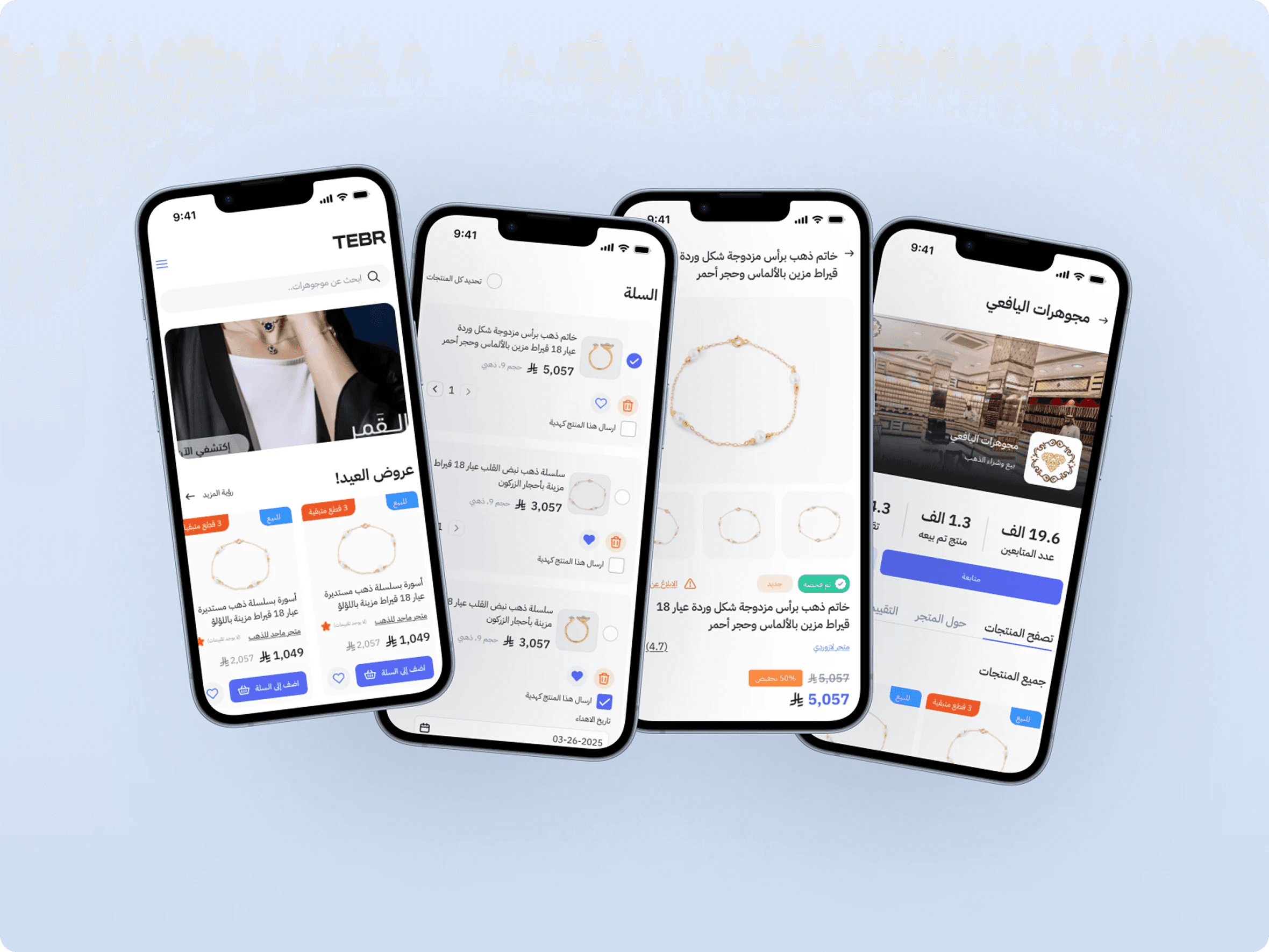
Marketplace Home
Goal: Fast product discovery + trust cues
Why this layout:
Users told us they wanted confidence before tapping details. So we surface:
Verified sellers
Certification badges
Clear pricing
Product Detail Page
Goal: Reduce uncertainty around gold value and authenticity
Features:
Certificate viewer
Seller rating & history
Trust visuals upfront
This ties directly to the main pain point.
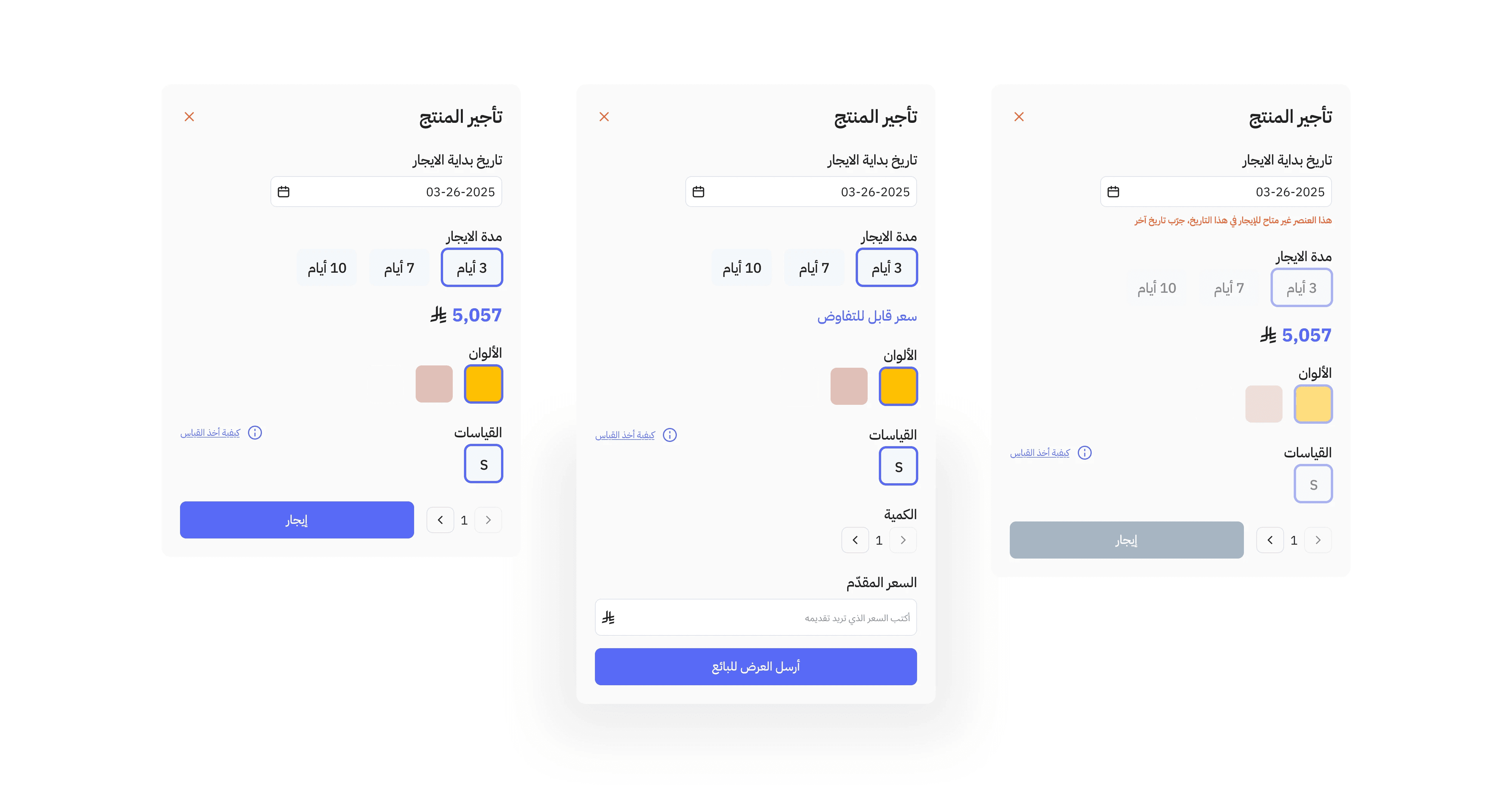
Rental Flow
Goal: Make rentals as clear as purchases
Design decision: Separate rent duration from price visually, reducing cognitive load in decisions.
📊 Validation & Learnings
Although the full customer testing was suspended due to legal limitations, we conducted internal usability feedback that pointed to:
Strong trust features aided decision confidence
Participants could complete core flows with minimal confusion
Visual consistency and cultural adaptation (Arabic UX) enhanced clarity
These insights validate the choice to prioritize trust and UI clarity early.
📈 Outcome
By focusing design decisions on trust, simplicity, and role clarity, Tebr became:
A marketplace that reflects real world expectations for high-value goods
A more usable platform than non-specialized competitors
A foundation for future growth into rentals and broader marketplace services
These tie design choices directly to business value, not just shiny UI screens.
🚀 Key Design Choices & Rationale
1) Prioritized MVP Features
From high-level needs, we defined:
Must-Have:
Product listing & browsing
Seller verification
Secure checkout
Should-Have:
Advanced filters
Rental capabilities
Shop inventory tools
Nice-To-Have:
Wishlists and reviews
Reason:
This ensured early releases focused on trust, simplicity, and core value.
2) Information Architecture & Flows
Balancing simplicity and complexity was essential:
Decision:
Developed flows that optimized:
Discovery to transaction
High-value transaction clarity
Minimal cognitive load despite multiple product categories
🖥️ Interface Highlights
Marketplace Home
Goal: Fast product discovery + trust cues
Why this layout:
Users told us they wanted confidence before tapping details. So we surface:
Verified sellers
Certification badges
Clear pricing
Product Detail Page
Goal: Reduce uncertainty around gold value and authenticity
Features:
Certificate viewer
Seller rating & history
Trust visuals upfront
This ties directly to the main pain point.
Rental Flow
Goal: Make rentals as clear as purchases
Design decision: Separate rent duration from price visually, reducing cognitive load in decisions.
📊 Validation & Learnings
Although the full customer testing was suspended due to legal limitations, we conducted internal usability feedback that pointed to:
Strong trust features aided decision confidence
Participants could complete core flows with minimal confusion
Visual consistency and cultural adaptation (Arabic UX) enhanced clarity
These insights validate the choice to prioritize trust and UI clarity early.
📈 Outcome
By focusing design decisions on trust, simplicity, and role clarity, Tebr became:
A marketplace that reflects real world expectations for high-value goods
A more usable platform than non-specialized competitors
A foundation for future growth into rentals and broader marketplace services
These tie design choices directly to business value, not just shiny UI screens.